Home » Articles » Types of Maps
Types of Maps
There are thousands of types of maps. Here are some of the most popular.
Article by: Hobart M. King, PhD
and Map Junkie
| Different Types of Maps |
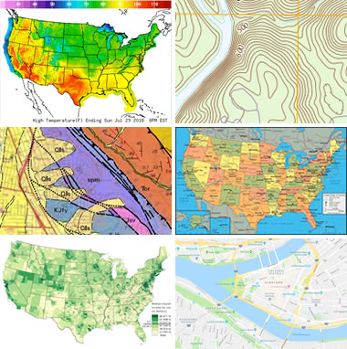
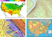
Different Types of Maps: Here are a few examples of the different types of maps discussed in this article. Clockwise from top left: weather map, topographic map, political map, digital street map, income map, and geologic map.
Table of Contents

Millions of Unique Maps
Millions of unique maps are in use throughout the world. Most of these maps can be placed into one of two groups: 1) reference maps; and, 2) thematic maps.
Reference maps show the location of geographic boundaries, physical features of Earth, or cultural features such as places, cities, and roads. Political maps, physical maps, road maps, topographic maps, time zone maps, geologic maps, and zip code maps are all examples of reference maps. A variety of reference maps have been created for almost every country of the world.
Thematic maps show the variation of a topic (the theme) across a geographic area. Weather maps showing daily high temperatures across the United States are familiar examples of a thematic map. They are made by starting with a reference map of the United States. Then temperature data is plotted atop of the reference map using colors to communicate the temperature forecast. Income maps and resource maps are other types of thematic maps.
In the sections of this article below, you will find several examples of commonly used reference maps and thematic maps.
| Political Boundary Maps |
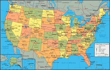
Political Maps show boundaries between countries, states, counties, and other political units. The most commonly used political map in the United States is a map like the one above that illustrates the 50 states. Many people find this type of map by going to a search engine and making a query for "us map" or "united states map". Geology.com has some of the most frequently viewed political maps of the United States and world countries on the internet.
Political Maps
"Political maps" are among the most widely used reference maps. They are mounted on the walls of classrooms throughout the world. They show the geographic boundaries between governmental units such as countries, states, and counties. They show roads, cities and major water features such as oceans, rivers and lakes.
Political maps help people understand the geography of the world. They are usually the first type of map that students are introduced to in school. They are also known as "reference maps" because people refer to them again and again as they have questions.
Political maps are often printed on paper or another physical medium, but they can also be produced in digital form, suitable for viewing online. Every day millions of people visit search engines to find political reference maps. Some of the most popular searches are for "united states map", "world map", "europe map", and "florida map".
Thousands of different political reference maps have been prepared to show the current geography of the United States. There are maps of the entire nation, maps for each of the 50 states, maps of the 3142 counties (parishes in Louisiana, and boroughs in Alaska) that make up the states. Most counties, boroughs and parishes are further subdivided into even smaller political units. An incredible number of political maps have been prepared just to display the geography of the United States.
The maps most commonly seen in classrooms and offices are political maps of the world, countries and continents. They are often annotated with push pins, sticky notes, photographs, marker flags and string to show the travels of a family, locations of a business, or other locations and activities worthy of display.
| Election Results Map |
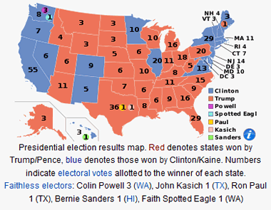
Election Results Map: Sometimes considered to be a different variety of "political map", "election results maps" show the results of an election by geographic subdivision or voting district. The most famous of election maps are the red-state / blue-state maps of the United States presidential election. In recent years they show states won by Republican candidates in red and states won by Democratic candidates in blue. The example above shows the results of the 2016 Presidential election of the United States. Map and caption from Wikipedia.
Election Results Maps
Election results maps might be considered to be a variety of "political maps". These maps show the geographic areas where a candidate for public office received a majority of support from voters. The geographic areas are usually political subdivisions of a country (states), of a state (counties), etc. The most famous examples of election results maps are the red-state / blue-state maps of the United States presidential election. States won by a majority of votes for the Republican candidate are known as "red states", and those won by a majority of votes for the Democratic candidate are known as "blue states". The accompanying map is an example. It maps the results of the 2016 United States presidential election.
These maps might be considered "thematic maps" while the election is in progress and while the results are in the news. However, shortly thereafter they might be considered as "reference maps" of historical significance.
| Physical Maps |
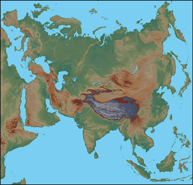
Physical Map: This physical map of Eurasia shows the topography of the land in a color-gradient relief. Dark greens are used for near-sea-level elevations, and the green grades to tan and brown as elevation increases. The highest elevations are shown in shades of gray. If you are familiar with the physical features of Eurasia, you can probably recognize the Himalaya Mountain Range, the Tibetan Plateau, the Alps, and the more subtle Ural Mountains. Lake Baikal, the world's largest freshwater lake by volume, can be seen in central Asia.
Physical Maps
Physical maps are designed to show the natural landscape features of Earth. They are best known for showing topography, either by colors or as shaded relief. Physical maps often have a green to brown to gray color scheme for showing the elevation of the land. Darker greens are used for near-sea-level elevations, with the color grading into tans and browns as elevations increase. The color gradient often terminates in shades of gray for the highest elevations.
Rivers, lakes, seas and oceans are usually shown in blue, often with a light blue color for the most shallow areas and darkening in a gradient or by intervals for areas of deeper water. Glaciers and ice caps are shown in white colors.
Physical maps usually show the most important political boundaries, such as state and country boundaries. Major cities and major roads are often shown. This cultural information is not the focus of a physical map, but it is often included for geographic reference and to increase the utility of the map for many users.
| Digital Road, Street and Highway Maps |
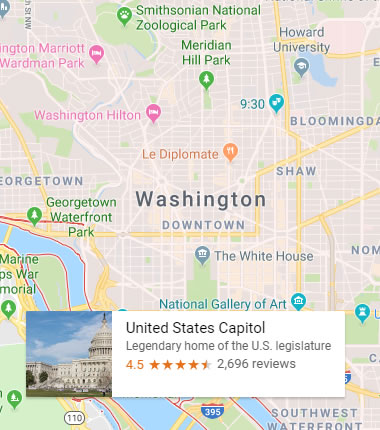
Google Map of Washington, D.C.: Google Maps has become the most commonly used online mapping service in the world. It superbly presents road and street maps. It is also the world's favorite route planning and street view service. The service has been specifically designed for those tasks.
Google Maps also has special tools that enable you to query "nearby" restaurants, hotels, bars and pubs, museums, pizza, bike shops, schools, attorneys, etc., and the map will populate itself with icons showing their location. If you allow Google Maps to use your current GPS location, you can use the "add destination" tool to plot a car, walking, bike, or public transportation route. Google Maps will even estimate the amount of time required for your trip. The author uses this feature of Google Maps more than any other mapping tool. :-)
Road, Street and Highway Maps
The digital mapping revolution caused an explosion of map creation in the 1990s. In 1996, MapQuest, the first popular online mapping service, allowed anyone with internet access the ability to create customized maps of almost any location in the United States.
Within a few months, millions of people had become "cartographers". They were soon producing more unique maps in a single day than had been created during the entire history of paper cartography!
Today, Google Maps is the world's most popular online mapping system. In addition to maps, the service also provides travel route directions. It can create directions for people who are driving, taking public transportation, walking, cycling or taking a plane.
Billions of unique maps, millions of travel routes, and millions of street views are created each day with Google Maps. It is the first place millions of people go to plan any type of travel.
Google has another product named "Google Earth" that allows people to view streets, roads and satellite images within a single interface. Google Earth is a free download - the software installs on your computer and fetches the image directly from the Google Earth server.
Finally, for people who want printed maps, the DeLorme Atlas & Gazetteer is a series of books that contain state-wide map coverage for individual states (or pairs of small adjacent states). The maps present a combination of road, topography, cultural and recreational information. These "hybrid maps" are a favorite of people who work and play outdoors in rural areas.
| Topoographic Maps |
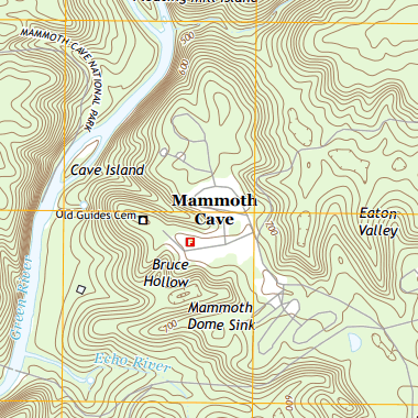
Topographic Map of an area within Mammoth Cave National Park, Kentucky. This map shows Earth's topography using brown contour lines with a contour interval of 20 feet. Roads, place names, streams and other features are also shown. Areas on the map where the brown contour lines are close together have steep slopes. Areas where the contour lines are spaced far apart have gentler slopes. If you would like to view the full 7.5-minute map of this area you can download a PDF file here. This map is a very large file (over 30 megabytes) and will take a few minutes to download on some desktop computers and mobile phones.
Topographic Maps
Topographic maps are reference maps that show the shape of Earth’s surface. They usually do this with lines of equal elevation known as "contour lines", but elevation can also be shown using colors (second map), color gradients, shaded relief and a number of other methods.
Topographic maps are frequently used by hunters, hikers, skiers, and others seeking outdoor recreation. They are also essential tools of the trade for geologists, surveyors, engineers, construction workers, landscape planners, architects, biologists and many other professions - especially people in the military.
Topographic maps also show other important natural features such as lakes, rivers and streams. Their locations are determined by topography, making them important natural elements of topographic maps.
Important cultural features are also shown on topographic maps. These include roads, trails, buildings, place names, bench marks, cemeteries, churches, schools and much more. A standardized set of special symbols has been developed for this use.
Topographic maps have traditionally been printed on large sheets of paper with their four boundaries being lines of longitude and latitude. The United States Geological Survey is the most widely known organization for producing them. They produce a series of 7.5-minute topographic maps covering most areas of the United States (a 7.5-minute map shows an area that is 7.5 minutes of longitude by 7.5 minutes of latitude). These maps and maps of many other scales are available from USGS in both print and digital form.
Commercial publishers of topographic maps include the DeLorme Atlas (paper maps in books with state-wide coverage) and MyTopo (a source of digital and paper maps in traditional topographic and topophoto formats - we are affiliates of MyTopo and receive a commission on referred sales).
| Time Zone Maps |
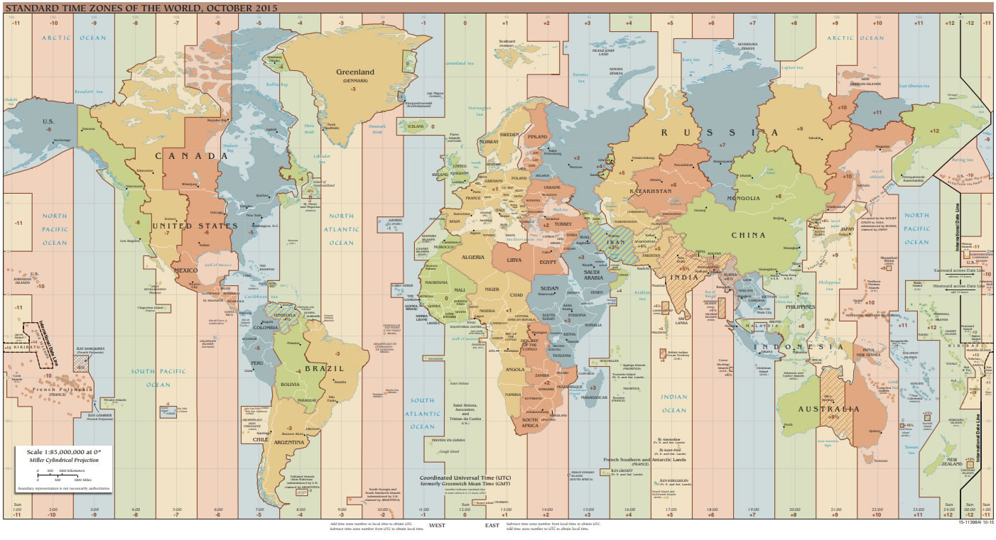
World Time Zone Map: On this map, the world's 24 time zones are shown as colored bands. By looking at the numbers along the top and bottom of the map, you can determine the time difference between two locations. Time zones do not follow lines of longitude. Instead they mostly follow political boundaries, with many variations made for social and commercial convenience. Click to enlarge this time zone map compiled by the Central Intelligence Agency.
Time Zone Maps
Time zones are regions of the world where people set their clocks to display the same time of day. This synchronization of time has many commercial, navigational, and social benefits.
By international agreement there are 24 time zones around the world. These 24 zones are shown in the accompanying time zone map. In each of these zones, 12:00 noon occurs at the approximate time of the solar mid-day. The actual solar noon occurs a little earlier in the east side of the time zone and a little later in the west. This variation is caused by Earth's rotation.
Time zone maps are reference maps that people use to determine the time in different parts of the world. For example if a person in New York City wants to phone a person in Los Angeles, he can look at a time zone map and determine that New York City time is three hours ahead of Los Angeles time. This helps people to avoid placing calls outside of business hours and helps people in different time zones schedule meetings and phone calls at mutually agreeable times. Time zones are usually superimposed on a political map of the world or a map of a large single country such as the United States.
| Geologic Maps |
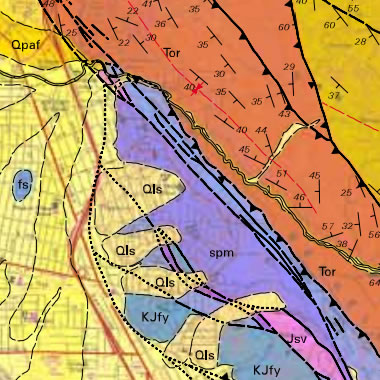
Geologic Map of an area near Richmond, California where the Eastshore Freeway makes an overpass above San Pablo Avenue. The roads and city streets can faintly be seen through the translucent colors of the geologic units. The western portion of the map is underlain by Quaternary sediments, while the eastern portion is underlain by folded and intensely faulted bedrock. Dotted lines show the probable traces of faults buried below the Quaternary sediments. Geologic maps of this area can be important first tools in conducting an earthquake hazard assessment. Source: Geologic Map and Map Database of the Oakland Metropolitan Area, Alameda, Contra Costa, and San Francisco Counties, California; by R.W. Graymer, U.S. Geological Survey Miscellaneous Field Studies MF–2342, 2000.
Geologic Maps
Geologic maps show the types of rocks and sediments present immediately below the surface of a geographic area. Sediment cover is shown in shades of yellow, and rock units are shown in a variety of colors, often based upon their lithology. Rock unit contacts, faults, folds, and strike and dip measurements are plotted in black.
Geologic maps are important data sources for many types of work. Certain types of rock are used for construction materials, and a geologic map shows where they are located at the surface. Other types of rock might contain valuable minerals, and a geologic map can be used as a preliminary tool for deciding where to drill or prospect.
Areas near volcanoes might be underlain by lava flows, lahar deposits, pyroclastic flows or other volcanic products. Geologic maps can be used to conduct a preliminary volcanic hazard assessment of an area.
Construction projects require good foundation materials and sources of crushed stone and other materials. Geologic maps can be used for the preliminary work of identifying potentially stable sites near economic sources of suitable construction materials.
| Geologic Map Cross-Section |
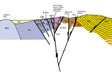
Geologic Cross-Section illustrating the subsurface structure of rocks in the map area above. This cross-section represents a southwest-northeast slice through the map area, showing folds, faults, a sediment lens and a view of the creeping portion of the Hayward Fault.
Geologic maps are made by geologists in the field who identify, sample, and measure the rocks. Because rocks are not exposed in all locations - especially in areas with heavy vegetation - they are often based upon fragmentary information. This fragmentary information can be supplemented when construction projects, landslides, stream erosion and other events expose rock beneath previously unobserved areas. As a result, geologic maps can be refined and updated as new information is obtained.
Most geologic maps are usually accompanied by at least one cross-section that illustrates what is expected to be seen if a "slice through the Earth" was cut across the map area. These cross-sections illustrate the geologic structures inferred by mapping the rocks and sediments above.
In the United States, most geologic maps available for public use or purchase are prepared by the United States Geological Survey and the State Geological Surveys. They do the fieldwork, prepare the maps, publish them, and offer them to the public in digital and paper formats.
| Zip Code Map |
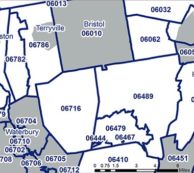
Zip Code Map: This map shows some of the zip codes in the state of Connecticut.
Zip Code Maps
Zip Code Maps are maps that show the approximate boundary of zip code areas used by the United States Postal Service. They are usually plotted over a base map that shows the roads and streets within the zip code area.
The United States Postal Service assigns zip codes for a section of a street, a collection of streets, an establishment, a structure, a group of post office boxes, or the area serviced by a single post office for the delivery of mail. Rather than consisting of geographic areas, zip codes are more in conformance with a group of mail delivery routes. In sparsely populated areas, a single zip code can cover many square miles, but in cities a zip code can be assigned to a single building or to an organization with a campus of buildings.
Businesses make valuable use of zip code maps by matching them to zip code tabulation data compiled by the United States Census Bureau. This data characterizes the population within a zip code by age, gender, race, national origin, income, housing, and much more. Companies can use this information to determine if they want to market to people within that zip code and how they want to market. They can also coordinate their mailings with the United States Postal Service to deliver their marketing materials to zip codes where demographic data suggests a high density of potential customers.
| Weather Maps |
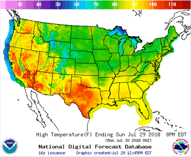
Weather Map showing projected high temperatures for Sunday, July 29, 2018. This is one of the many types of weather maps prepared by the National Weather Service of the United States and published online for anyone to use. Visit their website at weather.gov.
Weather Maps
People use an incredible number of weather maps. They are used to show predicted temperatures, predicted precipitation, storm warnings of various kinds, wind speed and direction, chance of precipitation, type of precipitation, snow accumulation, frost prediction and many other aspects of weather.
All of these weather maps are continuously updated to communicate the most current information. They are the world's most frequently consulted thematic maps. Weather maps are presented in newspapers, television programs and especially on websites. Delivering weather maps on websites and through web apps gives people around the world instant access to weather information.
Many weather maps are animated maps that show historical or projected changes in the weather. These are extremely useful for people who need to know how changes in weather will impact their travel, workday, recreation, and many other plans.
| Plant Hardiness Zone Maps |
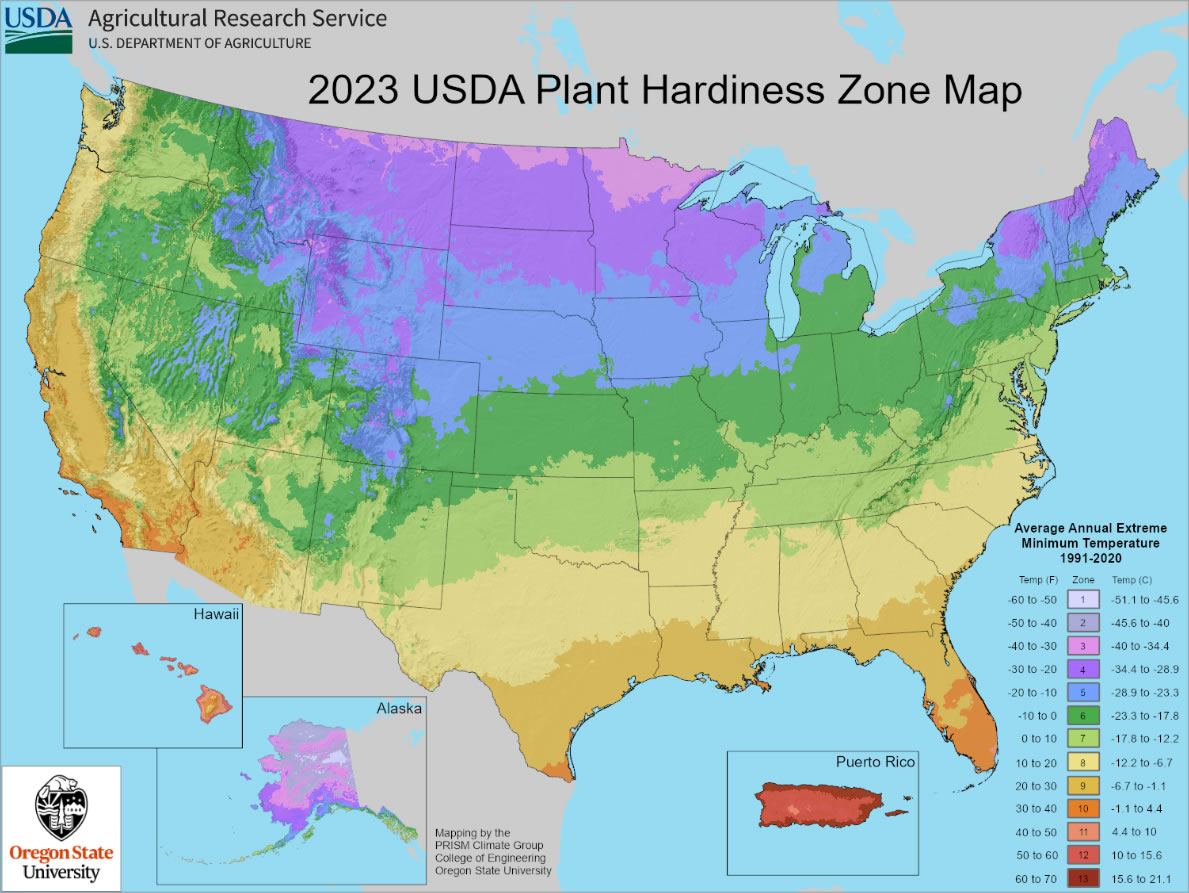
USDA Plant Hardiness Zone Map, 2023, by the Agricultural Research Service, U.S. Department of Agriculture. Click the map above for a larger image, or visit the interactive version of the map on the USDA.gov website.
Plant Hardiness Zone Maps
Many people enjoy spending time in their garden, where they plant flowers, shrubs, or vegetables. But how do gardeners know which plants will thrive in their particular geographic area? Some regions are too hot or too cold for certain types of plants. You wouldn't want to spend a bunch of time and energy planting species that aren't likely to survive.
The USDA Plant Hardiness Zone Map is a wonderful tool for gardeners. The different color zones represent the average annual extreme minimum temperature over a 30-year period. Zone 1 (shown in a pale lavender color) is the coldest zone, while Zone 13 (in dark red) is the hottest. People who live in the United States can zoom in to their location on the interactive map, or simply enter their ZIP code to find their local hardiness zone number(s). With this information, they can select plants with a hardiness range that encompasses their zone.
For example, the state of Ohio is mostly within Zone 6. Carrots (Zones 3-10) might do well in an Ohio garden. On the other hand, avocados (Zones 9-11) would not be a good choice.
| Species Distribution Maps |
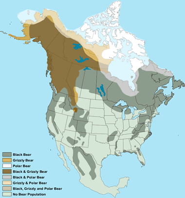
Species Distribution Maps show where certain plant or animal species can be found. This map shows where different types of bears live in North America.
Species Distribution Maps
The area normally inhabited by a plant or animal species can be mapped. These maps are made by compiling the locations where qualified people have repeatedly observed that species in the wild. The presence / absence of the species defines its geographic range.
The resulting maps show (by color or pattern) the geographic area where that species is encountered. These maps are known as "species distribution maps" or "geographic range maps."
Geology.com wanted a map that displayed the geographic distribution of bears in North America. That map was made by overlaying the geographic ranges of black bears, grizzly bears, and polar bears on a single map. Because the geographic ranges of these three species overlap, it is possible to be in an area where a person might encounter one, two, or even three different species. There are also areas of North America where a person would not expect to encounter a bear. The resulting map is shown in the accompanying image.
| Income Map |
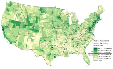
Income Map: Map showing the median household income of the United States using individual counties as enumeration units. Map by the United States Census Bureau. Click to enlarge.
Income Maps
Income maps are a very common type of thematic map. They show variations of income across a geographic area. The standard mapped variable for an income map is median household income.
Income tends to be highly geographic because rural portions of a state or country often have lower median household income than urban areas. Within urban areas, income can also be highly variable because neighborhoods tend to be populated by people with similar income levels.
The United States Census Bureau is a regular producer of income maps for the United States and individual states. After each major census, the Bureau updates its set of income maps and makes them available to the public. The Census Bureau also makes "change in income maps". These show which geographic areas have experienced economic growth or economic decline over a specific time interval.
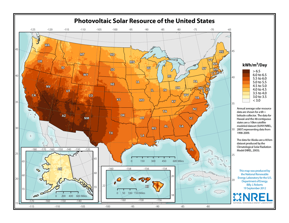
| Resource Map |

Resource Map: Map illustrating the the photovoltaic solar resource of the United States. It is clear from this map that the solar resource of the United States is greatest in the southwestern part of the country. Citizens, companies and governments can use this map to make decisions about investing in a solar power solution. Click to enlarge.
Resource Maps
Thematic maps are often made to communicate the geographic distribution of natural resources. These maps might show countries with the highest diamond production or the geographic extent of an oil or gas field. The map shown here illustrates the geographic pattern of solar generating capacity for the United States.
Resource maps are important because they help governments understand their natural resource assets and the natural resource assets of their allies and potential enemies. Resource maps help mining companies target their exploration efforts. They are also important for assessing the transportation opportunities and problems associated with the distribution of resources and the location of where they are consumed.
| Earthquake Maps |
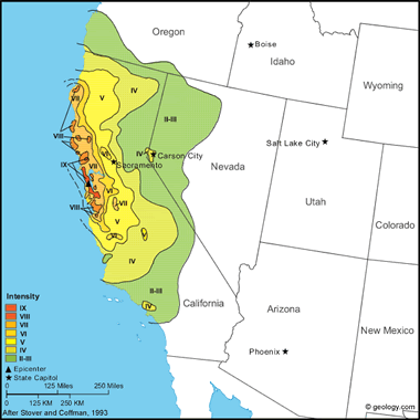
Intensity Map for the Great San Francisco Earthquake of 1906: This is the most devastating earthquake in California history. The earthquake was felt throughout most of California and into Nevada and Oregon. The earthquake and resulting fires caused an estimated 3000 deaths and $524 million in property loss. The map above shows the intensity of ground shaking across the felt area of the earthquake. Intensity levels are shown as a color sequence where red areas experienced the strongest ground shaking and green areas experienced ground shaking that was much less severe. A collection of intensity maps for numerous California earthquakes can be viewed here.
Earthquake Maps
Earthquake maps focus on the scientific aspects of earthquakes or on the impact and mitigation aspects. There are many types of earthquake maps. Here are a few:
Epicenter Maps show the geographic location of earthquake epicenters (the point on Earth's surface immediately above where the vibrations of an earthquake originated). They can show the location of one earthquake or the geographic distribution of many earthquakes. They have scientific value for understanding the distribution of earthquakes and mitigation value because they reveal areas where earthquakes frequently occur. Each epicenter is plotted as a symbol, and the symbols can have different colors, sizes and shapes to indicate the earthquakes' strength, depth, or date.
Fault Maps show the geographic location of faults. Faults are fractures in the Earth from which earthquakes and their vibrations emanate. Fault maps are of interest to scientists, and they are a geologic hazard map because future movements of the fault will generate the vibrations of an earthquake.
Intensity Maps show the geographic distribution of ground shaking caused by an earthquake. The intensity of shaking is measured using the Modified Mercalli Intensity Scale (explained in this article). Intensity maps are produced by obtaining intensity values from many locations within the felt area of the earthquake, plotting that data on a map, and contouring that data into areas of equal intensity. Intensity maps can be used as a measure of future earthquake hazard.
Earthquake Hazard Maps show geographic areas subject to specific types of hazards. They might show areas prone to the liquefaction of soil, areas prone to landsliding, and areas underlain by soft sediment that might cause unusually intense vibrations.
| Plate Tectonics Maps |
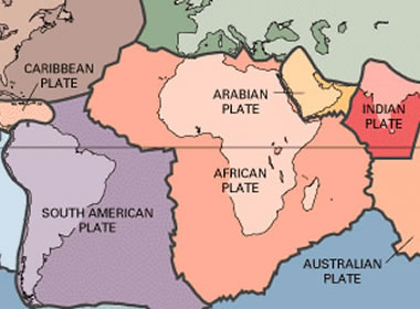
Plate Tectonics Map: A portion of a map showing the geographic extent and boundaries of Earth's lithospheric plates by the United States Geological Survey.
Plate Tectonics Maps
Plate tectonics is a branch of the geological sciences that deals with the movement and interaction of Earth's lithospheric plates. These plates move and interact with one another to cause earthquakes, volcanic activity, mountain building, the production of new lithosphere, the destruction of old lithosphere, and other geologic processes. Most of this activity occurs at lithospheric plate boundaries.
Geologists produce and use many types of maps in the study of plate tectonics. The most commonly referenced is a plate boundary map. These maps show the geographic extent and boundaries of the lithospheric plates.
Other types of maps used in the study of plate tectonics include: earthquake epicenter maps, volcanic activity maps, ocean floor age maps, plate movement direction maps, and many others. Much of the work done by geologists involves the production of a map.
| Bathymetric Maps |
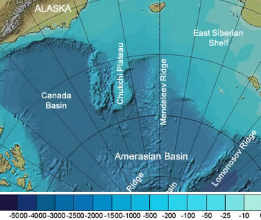
Bathymetric Map: A portion of a bathymetric map of the Arctic Ocean in color and shaded relief. Map by Intergovernmental Oceanographic Commission and others.
Bathymetric Maps
A bathymetric map, sometimes called a bathymetric chart, is a map that shows the depth of a body of water, such as a lake, a part of the ocean, a river, or a reservoir. Depths can be shown using contour lines, shaded relief, colors, or a combination of these methods.
Bathymetric maps are valuable for avoiding shallow or dangerous waters during ship navigation, planning construction projects, deciding where to fish, determining the cost of drilling for oil in a body of water, planning a trans-Atlantic communications cable, or finding a good place to scuba dive.
Making bathymetric maps used to be very expensive and time consuming. Depths were determined by "soundings" - lowering a weight on a cable to the bottom of the water body and determining the length of cable required. Today, depths can be determined by sonar and a variety of other remote measurement methods.
| Volcanic Hazard Maps |
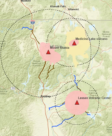
Volcanic Hazard Map for three volcanic areas in northern California: Medicine Lake Volcano, Mount Shasta, and Lassen Volcanic Center. For more information about volcanic hazards in California, visit the USGS website.
Volcanic Hazard Maps
Did you know that scientists have identified 161 volcanoes in the United States that will most likely erupt at some time in the future? Most of these volcanoes are in Alaska, but significant numbers are found in Hawaii, California, Washington, and Oregon.
People need to know which volcanoes present a danger, the types of volcanic hazards that can be expected, and the geographic area that will be dangerous if an eruption occurs. For that reason, geologists have prepared geologic hazard maps for the volcanoes that present the greatest risk to people and are working to complete maps for other volcanoes.
The accompanying map shows three areas designated to have a high to very high volcanic threat in northern California: Medicine Lake Volcano, Mount Shasta, and Lassen Volcanic Center.
At Medicine Lake Volcano: the dashed line represents the area that could potentially receive ashfalls of two inches or greater; the yellow area is where lava flows could occur; and the pink area is where near-vent hazards such as pyroclastic flows, lava flows, ballistics, lahars, or floods could occur.
At Mount Shasta and the Lassen Volcanic Center: the dashed line represents the two-inch ashfall hazard area, the pink areas could experience near-vent hazards, the brown areas could experience lahars, and the dark blue areas could experience floods.
| Hurricane Track Maps |
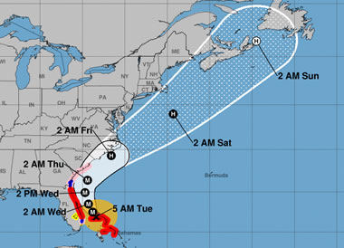
A Hurricane Track Map prepared for Hurricane Dorian, a category 5 storm that made landfall on the Florida, Georgia, and Carolinas coasts in late August and early September of 2019. More information about Hurricane Dorian can be obtained at the United States Geological Survey website.
Hurricane Track Maps
Hurricanes and tropical storms can cause enormous amounts of damage. When one of these storms is detected, the National Hurricane Center starts monitoring it and determining its anticipated path.
Once they have adequate information, online maps are published that show the anticipated path of the storm, the times that it is expected to arrive at specific locations, and the intensity of coastal hazards that might be expected. One of the online hurricane track maps for Hurricane Dorian, a category 5 storm that made landfall on the Florida, Georgia, and Carolinas coasts in late August and early September of 2019, is shown in the accompanying image.
| Map Drawn on a Clay Tablet |
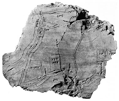
Map Drawn on a Clay Tablet: Photograph of a map on a clay tablet, drawn by an ancient mapmaker in about 1400 BC. It is believed to be a map of the city of Nippur, located in the area that is now known as Iraq. Image from Explorations in Bible Lands During the 19th Century by Hermann Volrat Hilprecht, public domain (1903). Click to enlarge.
.jpg)
Maps: Drawn, Printed and Digital
People have been making maps for thousands of years. The first map might have been a sketch made in sand using a stick or a finger. It might have been charcoal marks on a stone, or engravings on a clay tablet. Eventually maps were drawn on paper. The printing press enabled those maps to be printed on paper and distributed by the thousands.
Papermaking and printing eventually became inexpensive enough that almost anyone could afford to purchase a map, and until the late 1960s, many gasoline stations were still distributing free road maps as an advertising courtesy to their customers.
In the 1990s the internet enabled the distribution of maps online, and the economics of map distribution (and the ability to sell certain types of maps) were changed forever. Soon, with interactive map serving, any user of the internet could become a cartographer. Now more unique maps are produced online every day than were made in across the entire history of mapmaking, from pre-history until about 1992.
| More Maps |
 |
Gifts That Rock |
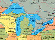 |
Great Lakes |
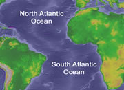 |
Map of the Oceans |
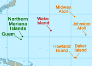 |
U.S. Territories |
 |
Types of Maps |
 |
Wall Maps |
 |
Map of the Ten Largest Deserts |
 |
What Is An Archipelago? |
Find Other Topics on Geology.com:
|
| ||
|
| ||
|
| ||
|
|